The Digital Lab - Improving Course Landing Page UX
The Digital Lab
Web app, landing page
2025
The Digital Lab is a Vietnamese EdTech platform offering professional courses in data, marketing, and communications through an LMS, in collaboration with UEH.
I was brought in as a freelance UI/UX Designer to improve the existing course landing page layout. Instead of redesigning from scratch, the goal was to refine key UI/UX issues and create a reusable template that could be applied across multiple programs such as DA, BA, and IMC.

Context & Problem
Context
The Digital Lab offers multiple courses such as Data Analytics (DA), Business Analytics (BA), and IMC. Each course had its own landing page, but they were designed independently without a shared system.
As a result, the overall experience felt inconsistent and difficult to navigate, especially for new users trying to evaluate a course.
Problem Statement
The existing landing pages had the right content, but the experience felt heavy, inconsistent, and hard to scan. The main issue was not only visual polish, the page structure did not guide prospective learners through a clear decision-making journey.
1. Weak visual hierarchy
Text sizes, weights, colors, and spacing were not used consistently
Too many elements competed for attention at the same time
Users did not have a clear reading path through the page
2. Content flow did not match user intent
The page introduced forms and dense curriculum details too early
Prospective learners first need to understand:
Is this course for me?
What will I learn?
Can I trust this program?
How do I enroll?
The old structure did not answer these questions in a natural order
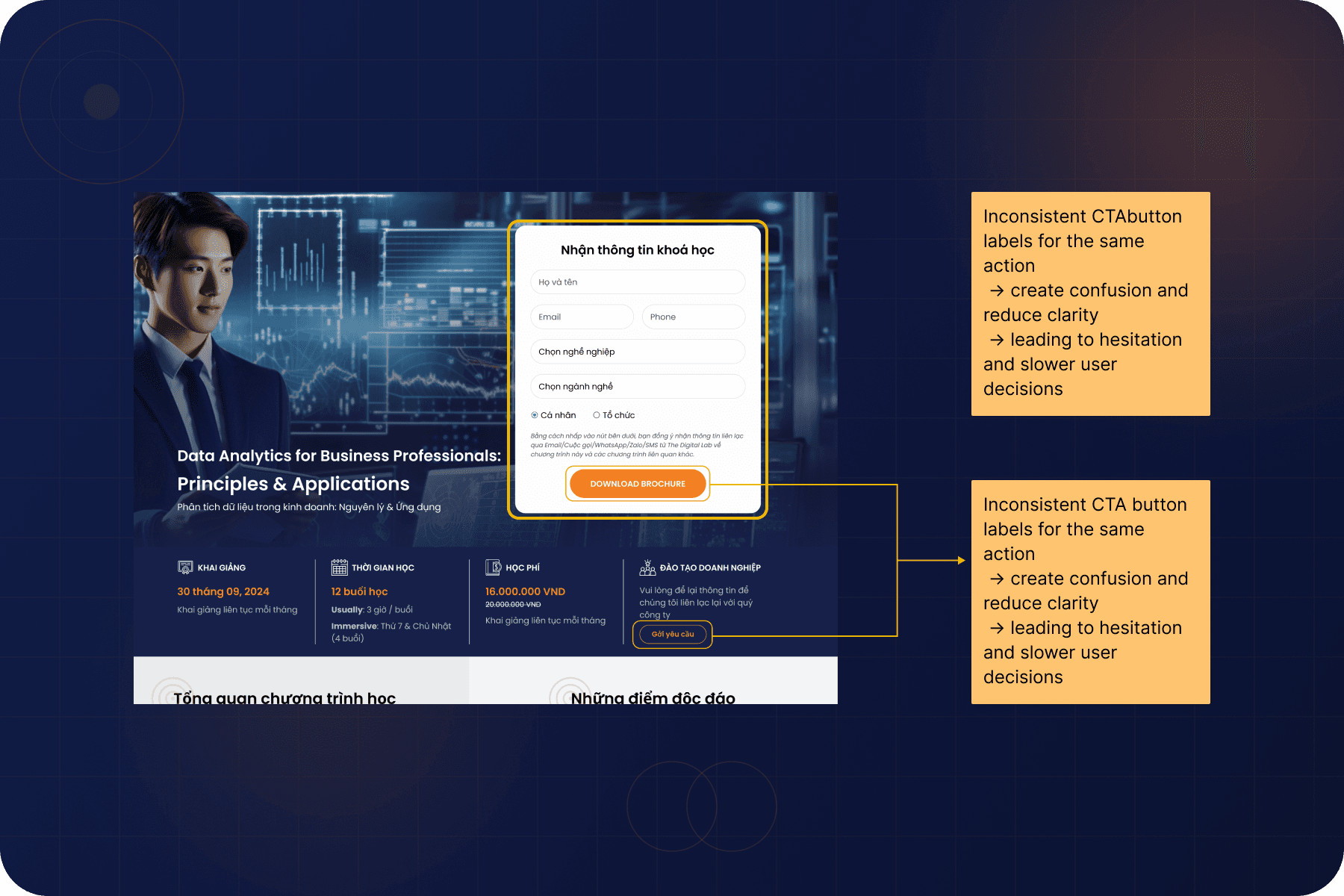
3. Weak CTA structure
CTAs appeared in different styles, sizes, and positions
Repeated buttons reduced the sense of priority
There was no clear conversion moment or guided enrollment path
Design Goals
Improve scanability so users can quickly understand the course
Create a consistent layout system across all pages
Align content flow with how users make decisions
Make CTAs clearer and more intentional
Build a reusable template for future courses

Given Solutions
1. Structured layout system
Standardized spacing, alignment, and section rhythm
Created a consistent container and layout grid
Made the page feel more organized and predictable
2. Stronger visual hierarchy
Reduced long text blocks
Introduced clearer headings and grouping
Highlighted key content:
Benefits
Outcomes
Important information
3. Reorganized content flow
Restructured sections to match user decision flow:
Introduction → value → details → trust → CTA
Delayed heavy content until after the core value is clear
4. Clearer CTA structure
Reduced visual noise from repeated buttons
Defined primary vs secondary CTAs
Placed CTAs at more intentional moments
5. Cleaner and more consistent UI
Simplified card layouts and section design
Standardized icons, colors, and typography
Removed unnecessary decoration
6. Reusable landing page template
Built a flexible layout for multiple programs
Applied across DA, BA, and IMC, etc…
Made future pages easier to scale and maintain


